VASSAL Reference Manual
Symbolic Dice Button
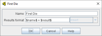
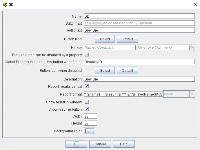
A Symbolic Dice Button places a button on the Toolbar which rolls dice that use graphical images to display their faces — in simpler terms, "dice that look like dice". A Symbolic Dice Button can roll one or more individual dice, each represented by a [Symbolic Die] component, each of which may in turn have any number of faces (represented by [Symbolic Die Face] sub-components). When the button is clicked, a random face is selected for each Symbolic Die that this component contains. The results of the roll can be reported as text into the chat area, and/or graphically in a separate window and/or in the button itself.
To add a Symbolic Dice Button to your module, right-click on the main [Module] entry at the very top of the Editor’s configuration window, and select Add Symbolic Dice Button. Then, once you do the initial configuration of its options, navigate to the [Symbolic Dice Button] component that will have been added at the very end of the Module’s list of components. Right-click on the [Symbolic Dice Button] entry, and select Add Symbolic Die. If you wish this button to roll more than one die, you can also add more. Then, you will need to right-click each [Symbolic Die] entry, and select Add Symbolic Die Face once for each face of the desired die (so a 6-sided Symbolic Die would have six Symbolic Die Face sub-components). You can then configure each of the components and sub-components.
|
|
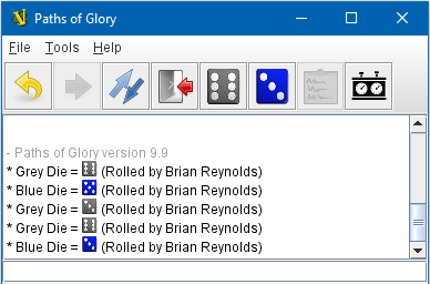
EXAMPLE - HTML with Dice: In the illustration below, a Symbolic Dice Button is configured to use HTML in its report format in order to display an image of the dice result in the chat log. Notice how the tag <img src="d6-$result1$-grey.png" width="14" height="14"> uses the $result1$ value to index the name of a png file to be displayed. Then, the width="14" height="14" portion forces the dice images to be scaled to the height of the text in the chat log. Later, the <span style="color:#ffffff;">$result1$ section displays a text version of the numerical result, but in "white-on-white" text which will be invisible unless the text is selected to be cut-and-paste into another window, thus preserving the numeric value in case the chat log is cut-and-paste into a different application.
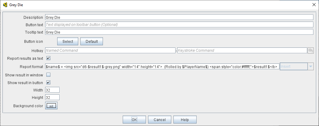
Example of a Symbolic Die configured to display dice images inline in the Chat Log. The $result1$ property is used to index the correct image filename.
Sub-Components
Symbolic Die
Once you’ve added a Symbolic Die to your Symbolic Dice Button (by right-clicking the [Symbolic Dice Button] component entry in the editor and selecting Add Symbolic Die), you can then right-click its own [Symbolic Die] component entry and select Add Symbolic Die Face. You’ll need to add one [Symbolic Die Face] for each "side" the die will have. So a traditional 6-sided die would of course need six die faces, though you can create dice with any number of faces desired, no matter how geometrically improbable!
|
|
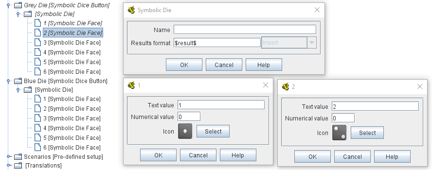
Symbolic Die Face
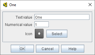
Each die face contains a text value, a numerical value, and an image.
|
|