VASSAL Reference Manual

Home > Module > Toolbar Menu


Toolbar Menu

The Toolbar Menu component lets you group buttons from the Toolbar of the main Module window or a Map window into a drop-down menu. Each button named in this component will be removed from the Toolbar and instead appear as a menu item in the drop-down menu.

Description:

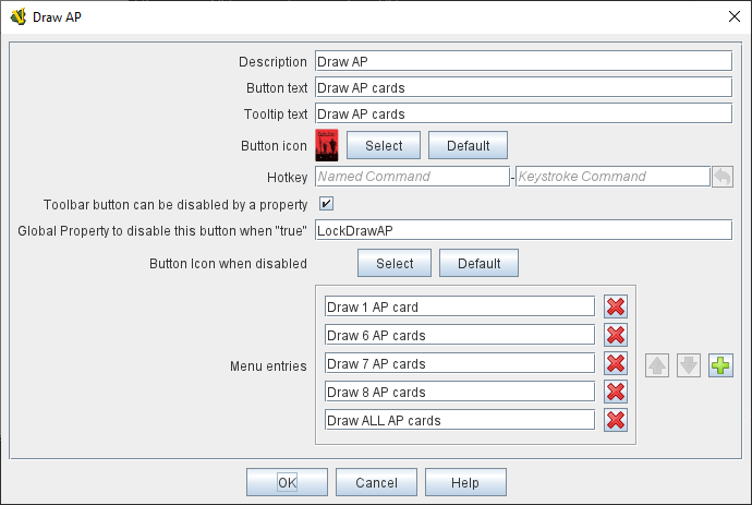
A brief description for your own use.

Button text:

The text of the new button to be added to the Toolbar. Clicking the button will reveal the drop-down menu.

Tooltip text:

Tooltip text for the new Toolbar button.

Button Icon:

Icon for the new Toolbar button.

Hotkey:

Keystroke or Named Command for revealing the drop-down menu.

Toolbar button can be disabled by a property:

If this box is checked, you will be able to enable/disable the Toolbar Button by changing the value of a Global Property. See also: Toolbar Configuration

Global Property to disable this button when "true"

The name of a Global Property that will control when this Toolbar Button is enabled or disabled. If the property contains the string true, the button will be disabled; if it contains any other value the button will be enabled.

Button Icon when disabled:

If you select an alternative icon here, then that icon will be used when the button is currently disabled. If you leave the icon empty, then the normal icon, if any, will stay in place. Any button text for the toolbar button will be greyed out when the button is disabled, regardless of your choice in this field.

Menu Entries:

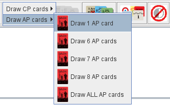
Enter the exact Button Text of the Toolbar buttons that you wish to move to the drop-down menu. The menu item will have the same text. If the button uses an icon, the menu item will also use it. The items moved to the drop-down menu will appear in the order they are listed.

Note
You must use the Button Text of the buttons, not a Hotkey Named Command.

ToolbarMenuExample

Example of a Toolbar Menu with a submenu.

ToolbarMenu

The corresponding Toolbar Menu configuration.