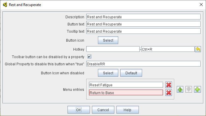
The Multi-Action Button combines buttons from the Toolbar into a single button.
The named would-be buttons are removed from the Toolbar and a new button is added.
Clicking this button automatically invokes the actions of all the removed & combined "buttons".
EXAMPLE: A Global Key Command is defined that resets the fatigue level of all armies on the map.
A second Global Key Command returns them to their home base.
A Multi-Action Button can be used to combine both actions into a single Toolbar button.
EXAMPLE: A Dice Button is defined that exposes its result as a property named Damage.
Some Game Pieces are defined with a Trigger Action trait that compares the level of a Layer (representing armor) with the Damage property and deletes the piece if the level is below the Damage value.
A Global Key Command invokes the Trigger Action.
A Multi-Action Button is defined that invokes the Dice Button followed by the Global Key Command, resulting in the automatic deletion of any units with armor less than the random amount of damage.
- Description:
-
A short description of this trait for your own reference.
- Button Text:
-
The text of the button to be added to the Toolbar.
- Tooltip Text:
-
Optional tooltip text for the Multi-Action Button.
- Button Icon:
-
Icon for the Toolbar button.
- Hotkey:
-
Keystroke or Named Command for the Toolbar button.
- Toolbar button can be disabled by a property:
-
If this box is checked, you will be able to enable/disable the Toolbar Button by changing the value of a Global Property. See also: Toolbar Configuration
- Global Property to disable this button when "true"
-
The name of a Global Property that will control when this Toolbar Button is enabled or disabled. If the property contains the string true, the button will be disabled; if it contains any other value the button will be enabled.
- Button Icon when disabled:
-
If you select an alternative icon here, then that icon will be used when the button is currently disabled. If you leave the icon empty, then the normal icon, if any, will stay in place. Any button text for the toolbar button will be greyed out when the button is disabled, regardless of your choice in this field.
- Menu entries:
-
Enter the exact Button Text of the Toolbar buttons that you wish to invoke as a result of clicking this button.
They will be invoked in the order listed.
Buttons will be invoked in the order listed.
|
Note
|
Enter the Button Text of the Toolbar Buttons you want to invoke, NOT the Named Commands attached to the buttons.
|
|
|
