VASSAL Reference Manual
Home > Module > Game Piece Image Definitions > Game Piece Layout > Game Piece Image
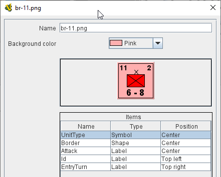
Game Piece Image
This component uses a layout created in a Game Piece Layout component to create an actual image. Here, you specify the colors, text, and images to use in the layout, as well as the name under which this image will appear in the image-chooser drop-down. You can then begin using this image in any other Vassal component or trait as if you had loaded it in from an external source.
The next section shows a visualization of what the finished image will look like with your choices. The Items panel shows the configurable items that make up your image layout. Click on an item to display the options available for that item in the bottom configuration panel. There is a different configuration panel for each type of item. |
|
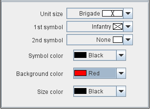
Symbol Item Configuration
|
|
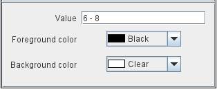
Label Item Configuration
|
|
Text Box Item Configuration
|
|
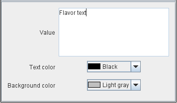
Image Item Configuration
Import an image to draw at the position specified in the layout.
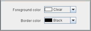
Shape Item Configuration
|
|