VASSAL Reference Manual
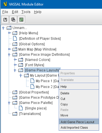
Home > Module > Game Piece Image Definitions > Game Piece Layouts
Game Piece Layouts
This component contains all the layouts used to define a Game Piece Image. Right-click on the [Game Piece Layouts] component and select Add Game Piece Layout to add a new layout.
A Game Piece Layout defines the general look and layout of the items used in drawing an image. Specific color and text information is defined later for individual piece images in the Game Piece Image properties.
|
Note
|
Once you have configured your new Game Piece Layout, you will need to right-click on its [Game Piece Layout] entry and select Add Game Piece Image to create one or more individual images based on your layout. |
An image is built up by drawing in order:
-
A rectangle of the background color.
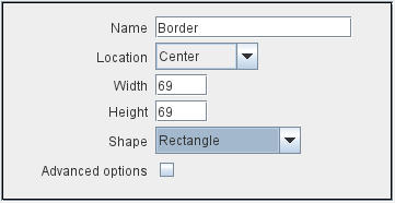
-
A border.
-
Each defined item in the order displayed in the Item panel.
|
|
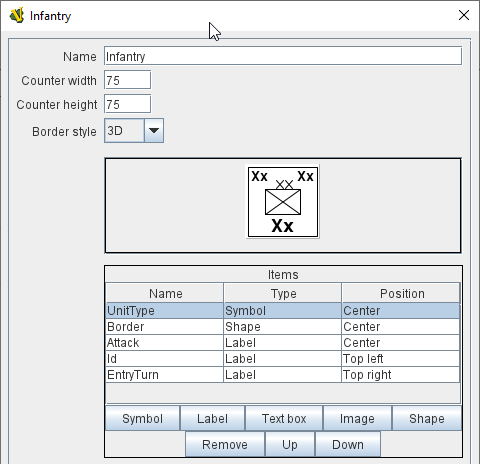
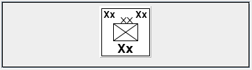
Visualizer
The next section contains a visualizer, showing you in actual size how your finished image will look. No colors or text have been defined yet, so sample text values and images placeholders are displayed. |
|
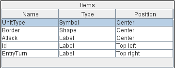
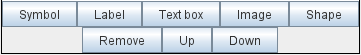
Item List
The Items panel shows the list of defined items for this Layout. Layout items are drawn onto the image in the order specified. Click on an item in the panel to display and edit its attributes in the lower display panel. |
Buttons
Use the buttons to add, remove or move items in the list.
|
|
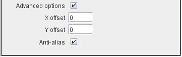
Advanced Options
Each item type has a checkbox to enable a set of advanced options to better control the position and display of the item.
|
|
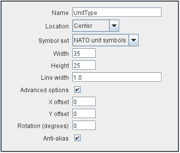
Symbol Item
A Symbol Item is a generic symbol to be drawn by the program. An Infantry symbol will be shown as a placeholder but the particular symbol is chosen later when configuring an individual Game Piece Image.
|
|
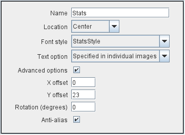
Label Items
A Label Item is a text label drawn in a particular font at a particular location. The value of the text can be specified in the individual images or in the layout, in which case all images using this layout share the same value.
|
|
Text Box Items
A Text Box Item is multi-line area of text drawn in a particular font at a particular location. The text in a Text Box will wrap to stay within the bounds of the box. The value of the text can be specified in the individual images or in the layout, in which case all images using this layout share the same value.
|
|
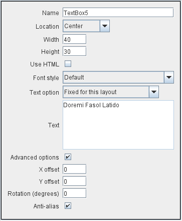
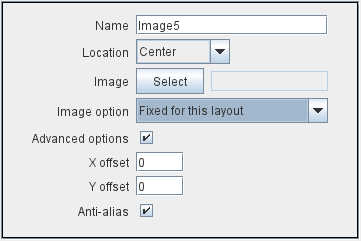
Image Item
An Image item is an imported image.
|
|
Shape Item
A Shape Item is a simple geometric shape.
|
|
Sub-Components
Game Piece Image
An image created using this layout. You can create as many individual Game Piece Images as you’d like using each Game Piece Layout. To add a Game Piece Image, right-click on the [Game Piece Layout] component where you created the desired layout and select Add Game Piece Image.