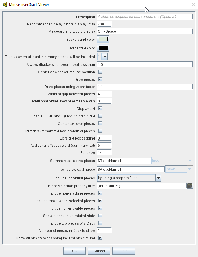
- Description:
-
A brief description of this component for your reference.
- Recommended Delay before display (ms):
-
When the mouse has been stationary for this many milliseconds, the viewer will appear.
This can be overridden in the preferences.
- Keyboard shortcut to display:
-
Players may display the viewer without waiting by pressing this shortcut key.
This can be disabled in the preferences.
- Background color:
-
Pieces/text are drawn against a background of this color.
- Text color:
-
Color of any text drawn.
- Border color:
-
Color of border around the overall viewer.
- Display when at least this many pieces will be included:
-
If set to 0, then the viewer will display even if the location is empty.
Otherwise, it will display only if 1 or 2 pieces have been included via the settings below.
- Always display when zoom level is less than:
-
Regardless of the above "at least this many" setting, the viewer will also display when the map’s magnification factor is less than this number.
- Center viewer over mouse position:
-
If checked, attempts to center the viewer over the mouse position.
- Outer border thickness:
-
Thickness in pixels of the border drawn around the rollover display.
- Inner border thickness:
-
If both Stretch options, below, are selected, then the inner border (between the pieces display and any text boxes) can be given a separate pixel thickness.
- Draw pieces:
-
If selected, then the included pieces will be drawn in the viewer.
- Center pieces vertically in box (if different sizes):
-
If selected, and multiple pieces of different heights are being shown, the smaller pieces will be vertically centered in the viewer
- Draw pieces using zoom factor:
-
The magnification factor to use to draw the pieces in the viewer.
- Width of gap between pieces:
-
Empty space in pixels to place between each drawn piece.
- Display text:
-
If selected, then the viewer will draw some summary text and some individualized text for each piece.
- Enable HTML and "Quick Colors" in text:
-
Enable the use of HTML and Quick Colors in the display text.
- Center text over pieces:
-
When selected, the text displayed above each piece will be centered over the piece, otherwise it will be left-justified.
- Stretch summary text box to width of pieces:
-
Stretch the size of the summary text piece to be the same width as the display of pieces, even if it would normally be narrower. Has no effect when text is already at least as wide as the pieces.
- Stretch pieces box to width of summary text:
-
Stretch the size of the pieces box to be the same width as the display of the summary text above the pieces, even if pieces display would normally be narrower. Has no effect when pieces already at least as wide as the text.
- Combined counter summary text box:
-
When stretching the summary text box to the full width, also don’t draw individual boxes around each summary entry.
- Only show first piece’s summary entry:
-
When stretching the summary text box to the full width, only show the summary entry for the first piece displayed.
- Additional offset upward (summary text):
-
The number of pixels to adjust the summary text box upwards from its usual position. Use negative numbers to adjust it down.
- Font size:
-
Fort size for the text drawn by the stack viewer.
- Summary text above pieces:
-
A Message Format specifying the text to display above the drawn pieces in the viewer.
In addition to standard Properties, you can include $countPieces$ to count the pieces included in the display. You can also include a property with the name sum(propertyName) where propertyName is a property defined on a Game Piece.
The sum of the numeric values of this property for all included pieces will be substituted.
Note: If you are using a Beanshell expression here instead of just substitution with $..$ then for sum you will need to use the following construct to access the sum or properties in a stack: GetProperty("sum(propertyName)").
- Text below each piece:
-
A Message Format specifying the text to display below each included piece.
- Text for empty location:
-
A Message Format specifying the text to display when no pieces have been selected.
- Include individual pieces:
-
Specifies whether/how pieces are to be selected for inclusion in the viewer based on their layer.
You may restrict the pieces according to the Game Piece Layer to which they belong.
- Piece selection property filter:
-
You may specify a Property Match Expression to match desired values of one or more Properties in order for a piece to be included.
- Include terrain beneath as an additional "piece":
-
If set to Always, the map/board surface beneath the pieces will be shown as if it were an additional piece. If set to If at least one other piece, the mapboard surface will be shown as long as at least one actual piece is found by this mouseover. If set to Never, the map/board surface beneath the piece(s) will not be shown.
- Force snap to map grid when displaying terrain:
-
If selected, then when showing terrain the center point will be determined by "snapping" the cursor location to the nearest region/hex/square in the map grid, regardless of whether the grid is normally set to "snap to".
- Width of terrain on map to grab for display:
-
When showing terrain, this specifies the width (in map coordinates) to be grabbed for display.
- Height of terrain on map to grab for display:
-
When showing terrain, this specifies the height (in map coordinates) to be grabbed for display.
- Zoom factor to display terrain:
-
When showing terrain, this specifies the zoom factor to display the terrain after it has been grabbed from the map.
- Text below terrain:
-
When showing terrain, this specifies optional summary text to display beneath the grabbed terrain icon (a similar function to the Text below each piece field).
- Show only top piece in stack:
-
If selected, then only the top piece in a stack is eligible to be displayed; otherwise the whole stack is shown.
- Include non-stacking pieces:
-
If selected, then pieces with a Does not stack trait specifying the piece does not Stack are eligible for inclusion in the viewer.
Otherwise, they are excluded regardless of any other filters.
- Include move-when-selected pieces:
-
If selected, then pieces with a Does not stack trait specifying the piece may only move when selected are eligible for inclusion in the viewer.
Otherwise, they are excluded regardless of any other filters.
- Include non-movable pieces:
-
If selected, then pieces with a Does not stack trait specifying the piece may not move are eligible for inclusion in the viewer.
Otherwise, they are excluded regardless of any other filters.
- Show pieces in unrotated state:
-
If selected, then pieces that can rotate are drawn in the viewer as they look when not rotated.
- Include top piece in Deck:
-
If selected, then the top piece of a Deck is eligible for inclusion.
- Include face down pieces in a Deck:
-
If selected, then face-down members of a deck are eligible for inclusion
- Number of pieces in Deck to show:
-
This many cards/pieces from the top of a deck are eligible for inclusion.
- Show all pieces overlapping the first piece found:
-
If selected, then all Game Pieces that overlap the mouse cursor location are eligible to be displayed; otherwise only pieces at the exact X,Y position of the top piece found are displayed.
- Don’t process further Mouse-over Stack Viewers when this one displayed:
-
If selected, then whenever this viewer is actively displaying (i.e. has found sufficient targets to display either pieces or text), then no further Mouse-over Stack Viewers will be processed — any additional viewers listed lower in the editor’s list of viewers for this map will be ignored. This can be used to prevent multiple viewers from drawing over top of each other without the need for highly elaborate filter logic.