VASSAL Reference Manual
Map Window
A Map Window contains the main interface for playing games with VASSAL. It displays the playing surface on which the players move Game Pieces by dragging and dropping with the mouse. It is possible to have two or more Map Windows; the players may drag and drop pieces between the different windows. A Map Window should be configured with at least one Map Board (in the "Map Boards" component).
To add additional Map Windows to your module, use the Editor to navigate to the [Module] entry at the very top of the Editor’s configuration window hierarchy. Right-click on the [Module] entry and select Add Map Window. Your new Map Window will be added to the very bottom of your Module’s list of components. You can then open the [Map Window] entry, where you should right-click on the [Map Boards] subcomponent and add at least one Board. You can also add additional subcomponents by right-clicking the [Map Window] entry and selecting one of the appropriate Add options. See Sub-Components, below.
Every map window (including player hands and private windows) exposes a property MapName_isVisible which will hold "true" if the map is currently visible, or "false" otherwise. This allows the module to know whether Global Hotkeys sent to that map’s components will currently be accepted or not. If the Map’s name contains spaces, the property name can optionally include '_' characters in place of spaces.
SEE ALSO: Player Hands and Private Windows are specialized forms of Map Window and share most of its properties and subcomponents. They are designed for holding pieces and cards that are private to one player or side.
|
|
Sub-Components
Map are created with several default sub-components, but new ones can be added. To add sub-components to a map, navigate to the [Map Window] component entry in the Editor, right-click on the [Map Window] component, and select the appropriate Add option for the sub-component you would like to add. Once you configure it, your new sub-component will appear at the bottom of the Map’s list of sub-components.
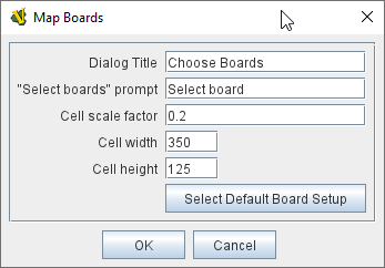
Map Boards
This component contains all the boards that may appear in this map window. It contains Board components and defines the dialog that is used to select boards when a new game is started.
|
|
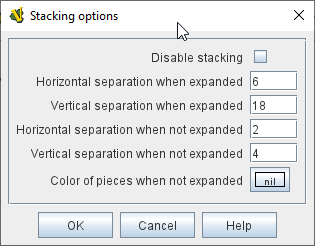
Stacking Options
This component controls how stacking is handled in this Map Window. It may not be removed.
|
|
Overview Window, or "Mini Map"
The Overview window displays a separate "Mini Map" subwindow over the top of the main map display. The subwindow contains a view of the entire playing area at a smaller scale than displayed in the parent map window.
The area of the map currently visible in the main map window is highlighted in the overview map with a colored rectangle. A player may click on the Overview window to center the Map Window at the point clicked on.
This component can be used by players to quckly get a high-level view of the whole map and scroll quickly to another area of the map.
See full article for details.
Line of Sight (LOS) Thread
The Line of Sight (LOS) Thread is a component that allows players to use the mouse to draw lines between two points on the map.
Options are provided to control color, snapping of thread ends, range display, reporting and visibility.
See full article for details.
Toolbar Menu
Groups buttons in the toolbar into a single drop-down menu. See full article for details.
|
|
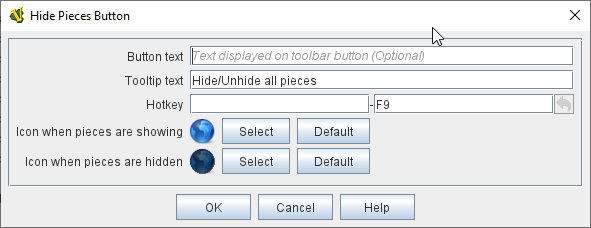
Hide Pieces Button
Adds a button to the Toolbar of the Map Window. Clicking the button will temporarily hide all pieces on the map, until the button is clicked again.
|
|
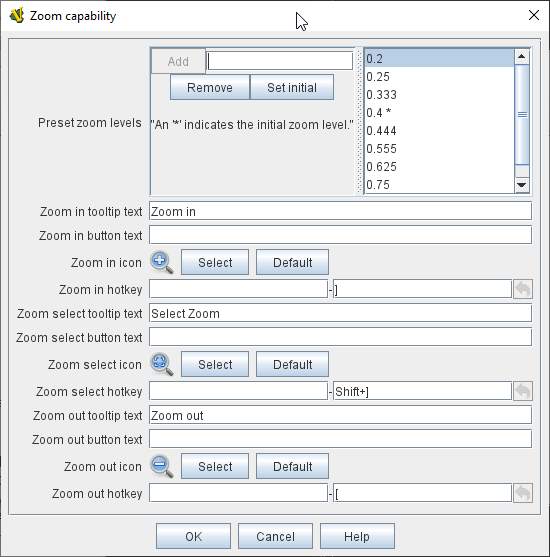
Zoom capability
Adds the ability to zoom in and out of the Map. Toolbar buttons for "Zoom in", "Zoom out", and "Select Zoom Level" are added to the Map Window’s toolbar.
|
Note
|
Zoom in and out can also be performed by holding the Control key down while using the mouse wheel. |
|
|
Mouse-over Stack Viewer
Adds a tool that displays the contents of the current Map location when the player leaves the mouse resting over the map.
The information displayed is highly configurable, including piece images, per piece text and summary text.
|
Note
|
You can define multiple mouse-over stack viewers for the same map, each operating on a different selection of pieces. |
See full article for details.
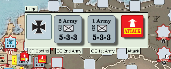
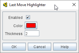
Last Move Highlighter
Draws a colored border around the last piece to have been moved, added, or deleted in a logfile or by an opponent during live play.
The highlight is cleared by clicking on the map.
|
|
Game Piece Layers
Allows you designate certain "layers" of Game Pieces to be drawn before others. Pieces in higher layers are always drawn on top of lower layers, and pieces never combine into stacks with pieces from other layers.
See full Game Piece Layers article for details.
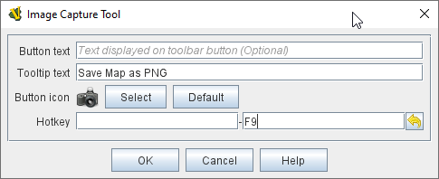
Image Capture Tool
Adds a "Camera" button to the Toolbar of the Map Window. Clicking the button will dump the contents of the Map Window to an image file. This allows you to take a screen shot even if the Map Window is too large to fit entirely on the screen.
|
|
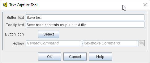
Text Capture Tool
Adds a "Save Text" Button to the Map Window’s Toolbar. Clicking the button will write a plain text summary of the contents of the map to a text file, using the names assigned to the pieces and the appropriate numbering and/or naming of the board’s grid.
|
|
Deck
A deck of cards, a bag of chits, or a fixed supply of counters. Decks are versatile containers for collections of pieces — especially the kind that need to be shuffled, randomized, hidden, and drawn from. See full article for details. |
|
At-Start Stack
A group of one or more pieces which begin the game on the map. See full article for more details. |
|
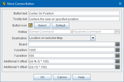
Move Camera Button
Adds a button to the map window’s Toolbar. Clicking the button will center the camera (i.e. the map’s view) on a designated location. The location can be computed through a variety of means, including expressions.
|
|
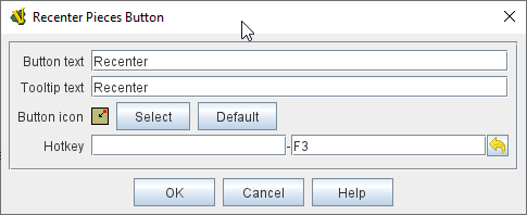
Recenter Pieces Button
Adds a button to the map window’s Toolbar. Clicking the button will shift the position of all pieces on the map such that they are centered around the middle of the map as much as possible. This is useful for games where there are no absolute terrain features, such as some air and naval games.
|
|
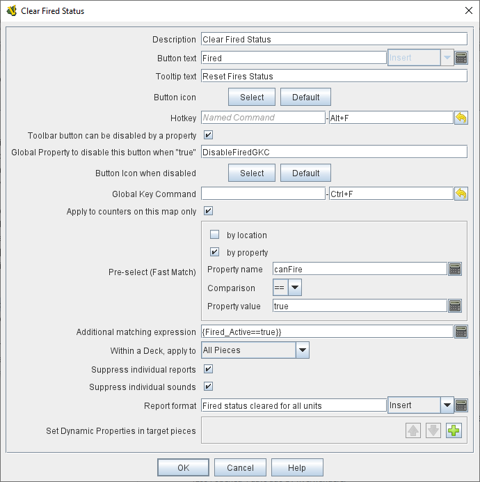
Global Key Command
Adds a button to the map window’s Toolbar. Clicking the button will pick certain pieces from the map window and apply the same key command to all of them.
See the GlobalKeyCommand.html page for full details on using Global Key Commands. |
|
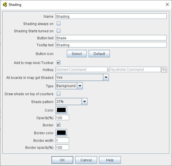
Map Shading
Applies a semi-transparent solid color or image tiling to the Map. In background mode, can be used to overlay a repeating image over solid-color boards. In foreground mode, the area is determined by the pieces on the map that name this Map Shading in an Area of Effect trait.
|
|
Global Properties
Maps can have their own Global Properties, which apply to and are accessible by pieces on that map.
To add a Global Property to your map, find the [Global Properties] subcomponent in the Editor, right-click it, and select Add Global Property. This will let you define the initial value and any numeric constraints. Then, you can right-click on the [Global Property] entry to optionally Add Change-property Toolbar Button, the configuration dialog for which is shown at left.
See the article on the Global Property trait of pieces for more details and examples.
|
|
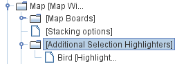
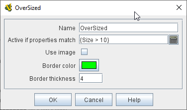
Additional Selection Highlighters
Allows you to define additional ways to highlight the selected piece on a map. The additional highlighters are drawn only if the selected piece matches the specified properties. If a piece matches the properties of more than one highlighter, all will be drawn, in addition to the highlighting color/border specified in the Map’s properties.
To add an Additional Selection Highlighter to your map, locate the [Additional Selection Highlighters] subcomponent of your map in the Editor. Right-click it and select Add Highlighter. You can then configure your Highlighter using the dialog described below.
|
|
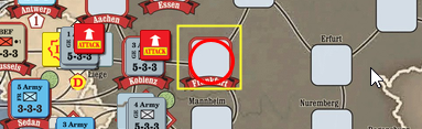
Flare
A Flare lets players their opponents' attention to something that has happened on the map by clicking a with certain modifier keys held down. The flare will be visible to other players both in online games and in play-by-email games using a log file.
|
A Flare component is automatically added to each Map, so you will not normally need to add more. However, to add a Flare to your map, find your [Map] component in the Editor, right-click it, and select Add Flare. See the full Flare article for more details. |