VASSAL Reference Manual
Toolbar

The Toolbar of the main Module window contains buttons for basic functions such as Undo, Step Forward, and Server Controls, but you can also configure buttons to roll dice, add pieces to the map, display charts and maps, keep player hands and reinforcement pools private, and more.
Buttons for basic functions are created by configuring the existing basic components of the module, such as Global Options and the Definition of Player Sides.
Buttons for Maps, Charts, Dice, and other additional buttons are created by adding new Sub-Components to the Module. In some cases, Toolbar buttons can also be created by adding sub-components to a Map window.
Toolbar Configuration
Although there are many types of toolbar buttons (see below), most of them share certain basic configuration fields.
|
|
List of Toolbar Components
Retire |
|||
Basic Toolbar Buttons
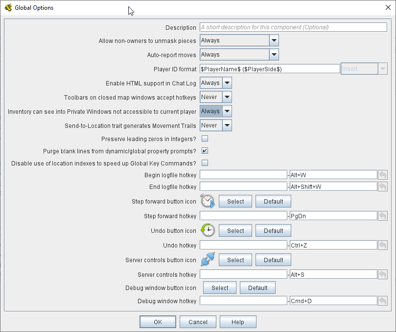
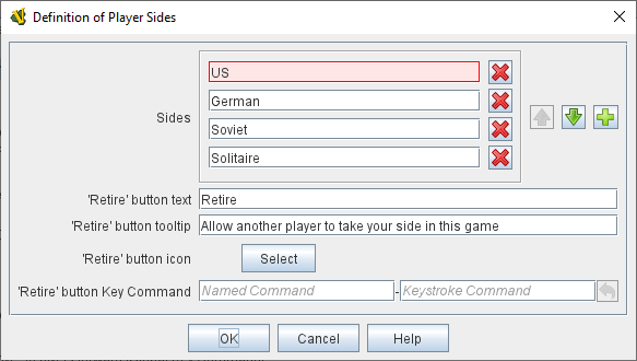
UndoAn Undo button allows players to back up one or more steps, undoing those moves and/or actions, if a mistake has been made. An Undo button can be added by configuring the Global Options component of the main Module. The Undo button can be given a button image and a hotkey. Step ForwardThe Step Forward button is how play-by-email (PBEM) players can step forward through an opponent’s actions when loading a LogFile (VLOG) file from them. Upon loading the log file, the Step Forward button will become "active", and the player viewing the log can use the button to step forward a move at a time. Once the log file reaches its end, the Step Forward button will grey back out again and the player can make the next moves. The Step Forward button is configured in the Global Options component of the main Module: it can be given an image and a hotkey. Server ControlsThe Server Controls button opens the sub-window that allows online players to communicate with a VASSAL Server to find and begin online games. The Server Controls button is configured in the Global Options component of the main Module: it can be given an image and a hotkey. Retire / Switch SidesThe Retire button (or in some modules, the Switch Sides) is configured in the Definition of Player Sides, a sub-component of the Module itself. If the button is given either button text or a button icon, it will appear on the Toolbar and allow players to switch between sides (e.g. in a "hotseat" game), become an observer, and/or select a side they want to play. |
Global Options (Undo, Step Forward, and Server Controls buttons)
Retire or Switch Sides, in Definition of Player Sides |
Pieces and Hands
Several types of Toolbar button can be configured to provide places to bring pieces onto the board.
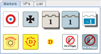
A Game Piece Palette allows an unlimited number of pieces to be created and placed onto any map. This can have several uses — it can be used as an unlimited supply for certain counters and markers during play. One can also be fleshed out with the full counter-set and used as a place from which to set up a game initially to create Predefined Scenarios. A module can have more than one Game Piece Palette, each with its own Toolbar button. Or, a single Game Piece Palette can have any number of tabs and sub-panels. |
A Game Piece Palette With Markers |
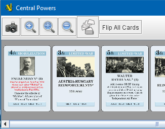
Player HandA Player Hand is a specialized Map Window for containing a hand of cards. It is designated as belonging to a particular side or sides. The owning sides must correspond to one or more of the sides defined in the definition of player sides. The main difference between a Player Hand and a Private Window is that in a Player Hand, the contents are automatically laid out in a row instead of stacking like counters. |
A Player Hand window (at small zoom). |
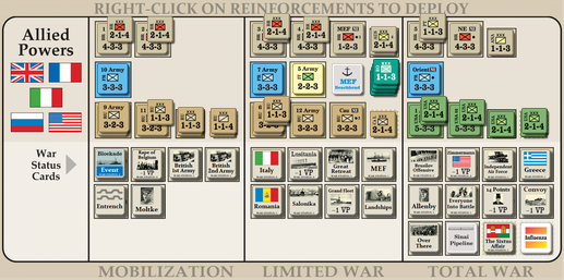
Private WindowA Private Window behaves much like a Map Window but it is designated as belonging to a particular side or sides, and can optionally be hidden from all players not playing one of the owning sides. The owning side(s) must correspond to one or more of the sides defined in the definition of player sides. Private Windows are often used for secret reinforcement pools. |
Player Windows can be used for secret reinforcement pools. |
Dice and Randomization
Many modules include Toolbar buttons to roll one or more dice.
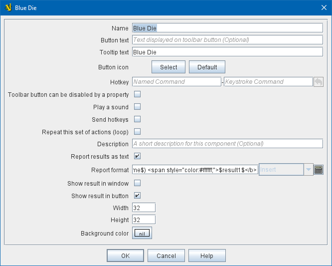
Symbolic Dice ButtonA Symbolic Dice Button places a button on the Toolbar which rolls dice that use graphical images to display theirfaces — in simpler terms, "dice that look like dice". Multiple dice can be rolled at once, and the results can be shown in many ways, including by the Toolbar button itself and by messages displayed in the Chat Log |
Symbolic Die Faces
Configuring a Special Dice Button
|

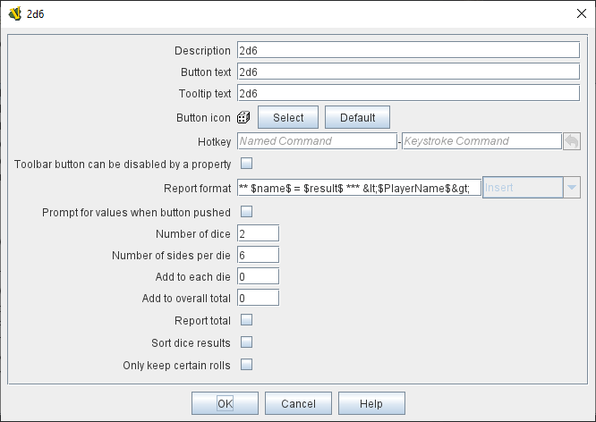
Dice ButtonA plain Dice Button can roll multiple dice of multiple sides and add the total with various modifiers being applied, but it does not have an inherent facility for displaying graphic images of the dice. |
|
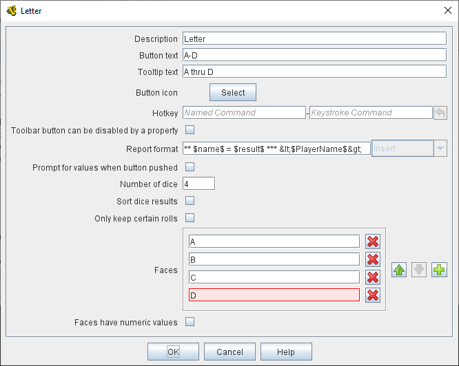
Random Text ButtonA Random Text Button can be used to randomly select a text message from a list defined beforehand. For example, a button can be defined to select a random letter "A" "B" "C" or "D". Enter each test message into the box to the left of the Add button and then click the Add button. It can also be used to define dice with irregular numerical values, such as a six-sided die with values 2,3,3,4,4,5. If the values are numerical check the Faces have numeric values box, which enables the Report Total and Add to each die options. |
|
Maps and Charts
MapsEvery module needs at least one Map, but there is no limit on the number of additional map windows which can be configured for use as additional play space, reinforcement cards, off-board pools, or any other purpose. Each map window can be given its own Toolbar button which will show/hide it. |
Map art from Nevsky (c) GMT Games |
Chart WindowsChart Windows can be used to hold player aids, combat tables, and the like. The main difference between a Chart Window and a Map Window is that Chart Windows do not interact with Game Pieces. |
Chart excerpt from Empire of the Sun |
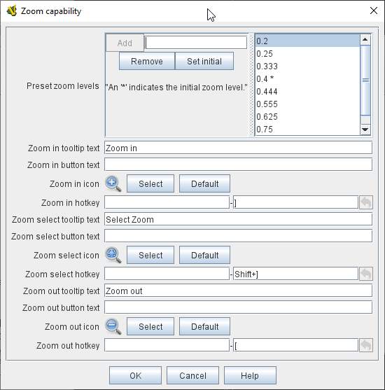
Zoom In, Zoom Out, Zoom SelectMap Windows (as well as Private Windows and Player Hands ) can have Zoom capability added to them. If so, buttons to Zoom In, Zoom Out, and select a specific Zoom scale will appear on their Toolbars (and in the case of Zoom buttons on the Main Map window, will appear on the main Module toolbar). Because they are a sub-component of a Map, they are added to a Map component rather than directly to the Module. |
Zoom Buttons from a Toolbar
Zoom configuration
|

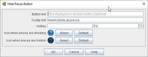
Hide PiecesA Hide Pieces button lets you temporarily hide all the playing pieces so that you can see the map underneath. This button is configured by adding it to a Map Window. If it is added to the Main Map then it will appear on the Toolbar in the Module window. |
|
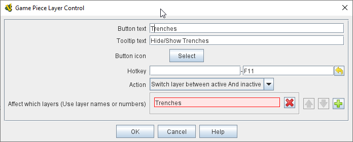
Game Piece Layer ControlGame Piece Layer Control buttons allow you to temporarily hide a subset of pieces (e.g. hide the fort markers while leaving the troops visible). This button is configured by adding a subcomponent to a Game Piece Layers subcomponent of a Map Window. The button will appear on the Toolbar for the Map Window (or in the case of the Main Map, on the Toolbar for the Module). |
|
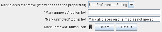
Mark Unmoved ButtonThe Mark Unmoved Button button clears the movement history for all pieces on a particular map. This both removes any Mark When Moved from pieces on the map and clears any Movement Trails. A Mark Unmoved button is configured as part of the Map Window’s properties dialog, and appears on the Toolbar for that Map Window. If one is configured for the Main Map, it will appear on the Toolbar for the Module. |
|
Actions and Commands
Buttons to invoke custom commands and actions.
Global Key CommandGlobal Key Command buttons send an action to every Game Piece that matches a given Expression. If configured to a specific Map, it will appear on that map’s Toolbar and affect only pieces on that map. If configured as a subcomponent of the Module itself, it will appear on the main Module Toolbar and will affect pieces on every map. |
|
Action ButtonAn Action Button combines a number of different actions into a single button. When the button is clicked, or receives its Hotkey, it can display a message to the Chat Log Window, Play a sound, and/or send a list of Hotkeys or Named Key Commands to other components. |
|
Multi-Action ButtonA Multi-Action Button combines several buttons from the Toolbar into a single button. The named would-be buttons are removed from the Toolbar and a new button is added in their place. Clicking this button automatically invokes the actions of all the removed & combined "buttons". |
Multi-Action Buttons group several "buttons" into one. |
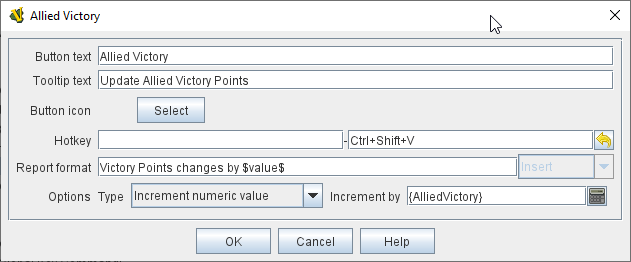
Change-Property Toolbar ButtonA Change-Property Toolbar Button changes the value of the Global Property. You can combine multiple buttons into a single drop-down menu using a Toolbar Menu. Change-Property Toolbar ButtonSee full article for details. |
Change Property Button configuration |